Well, there you have it: the first, official sneak-peek into the Fuwanovel site redesign. You can see it live for yourself at http://beta.fuwanovel.net. The theme as you see it in the image above was designed by the brilliant Emi (and if you like the new look, be sure to let her know!). Nay worked hard to make it responsive, so be sure to try it out on all your devices.
The redesign team is hard at work: we’re very lucky to have the combined artistic superpowers of Emi and Beato, with Nayleen as our coder extraordinaire, and Rooke editing all the text assets I throw at him. These are extremely talented individuals, and I feel extremely fortunate to be working with them. There is still a lot to do, however, and until the new site is ready for launch, we will be keeping the classic Fuwa front site live at the fuwanovel.net domain.
But wait! There’s more!
One of the coolest features of the new site is a theme changer. We’ve got three themes up, ready for you to check out live:
- Emi’s Official/Summer Sky Theme
- Sekai Spirit Theme
- “Old School Cool” Theme (< Nay’s gift to all of you who loved the site look)

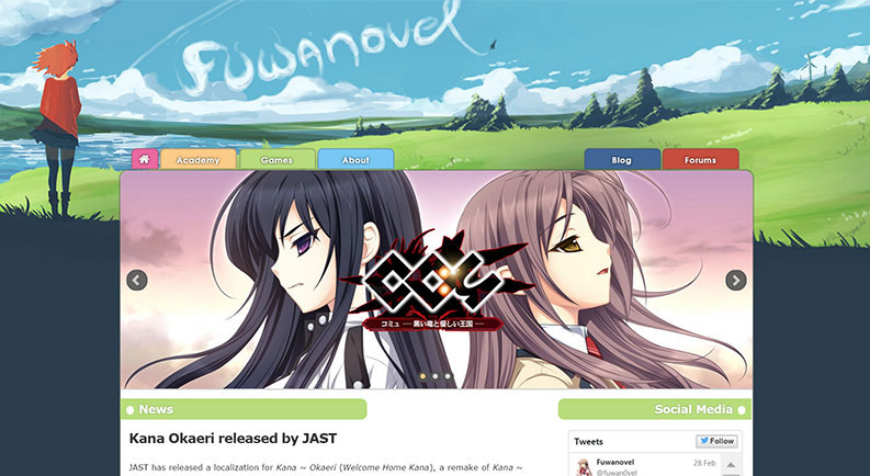
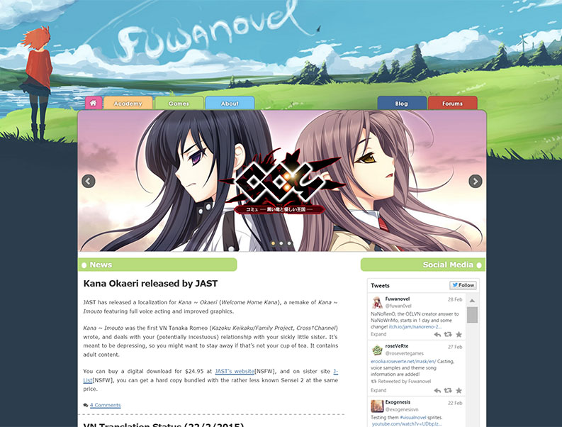
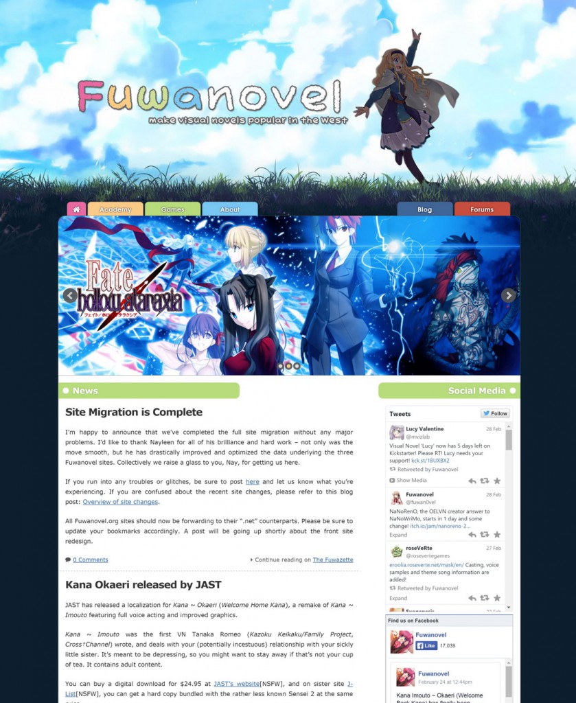
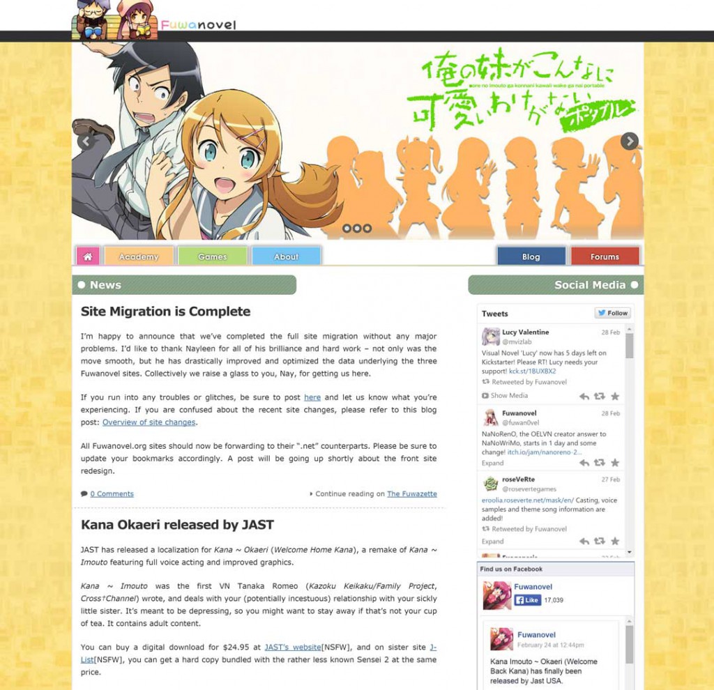


oooo fate ms1 title screen, good pick. Already seen the other themes~
< 3 Nay's classic theme turned out really well, too, I think. Nice blend of old and new.
The Old School Cool theme includes things I’ve wanted to do since the backend (admin panel) rework waaay back, like:
– Don’t use too many images / replace them with CSS wherever they’re not necessary (http://fuwanovel.net/assets/images/en/menu-sprite.png *cough*)
– Fix resizing issues (in this case, make it completely responsive, way to overshoot a goal)
– Make seasonal themes way easier to implement
– Split the individual pages into way more interchangable blocks which can be moved/overridden per theme (as is happening with the navigation on the Old School Cool theme)
White on light green (“News” and “Social Media”) is hard to read.
Duly noted (and noticed it myself on the monitor at work already) – the contrast needs to be higher/the text needs a slight text-shadow like the green navigation tab.
Nice work, all of you. It’s a bit hard to decide between the two first themes, they look really nice (not that I have anything against the Old School one but not so much to my liking).
I’m always a bit envious of people like you lot. All my motivation sums up to is enjoying (wasting) my spare time (e. g. with Visual Novels, who would have thought..). Because it really looks like quite some work you have put in the changes.
I’m not exactly expert or creativity when is come to design a website, but I like Summer Sky theme.
I prefer simple design and menu is just right.
what happened to the torrents in fuwanovel?
Woow, Long Time I Last Checked This Site and Become Great Like This, For Me I Like “Sekai Spirit” Theme, Keep It Up ^_^